"A Timeline...."
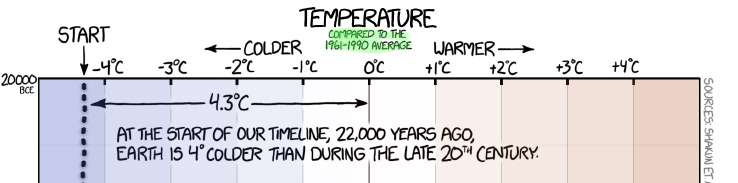
The temperatures shown...are *relative* to the 1961-1990 average, which was 14.0 C (57.2 F).
So "-4 C" really means 4 C below that average. Therefore 14.0 -4 = 10 C.
Read and write some short responses
Read through the whole thing: "A Timeline of Earth's Average Temperature" (XKCD-Randall Munroe). Go to: xkcd.com/1732.
This is a cartoon, and evidence, and entertainment, and an argument all rolled into one. Respond to the questions below...
- Is there any evidence that you can see to indicate that the temperature data that Munroe presents is not just made up? Why should / shouldn't we trust the data he's claiming to display?
[Without citations] I wouldn’t know if the information is coming from reputable sources or not.
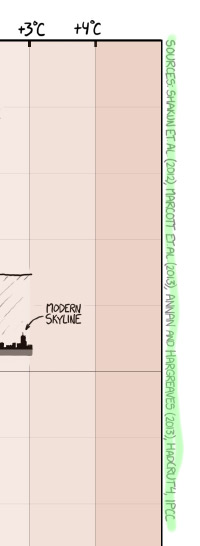 The sources are cited along the right side of the cartoon.
He ... seems to have a pretty accurate timeline with regards to animals that go extinct (ignoring the pokemon), human inventions, and the movement of humans across the world.
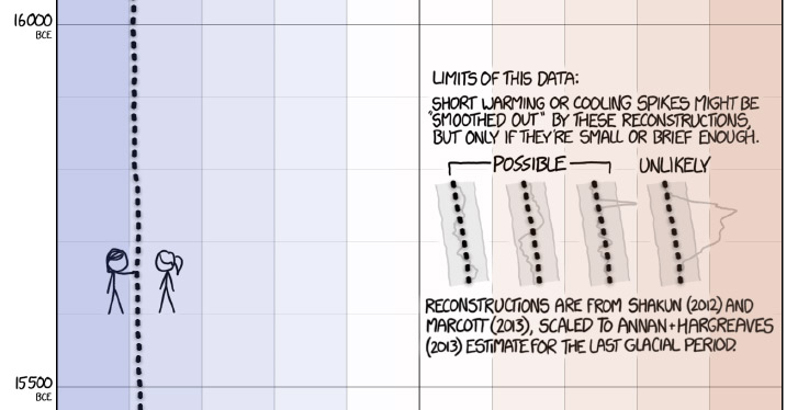
Another indication of credibility is some discussion of uncertainty of the data.
Only the first author's name and dates are given, "Shakun, et al, 2012", But you can still find the papers by looking up those two pieces of data at google scholar.
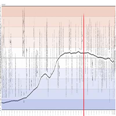
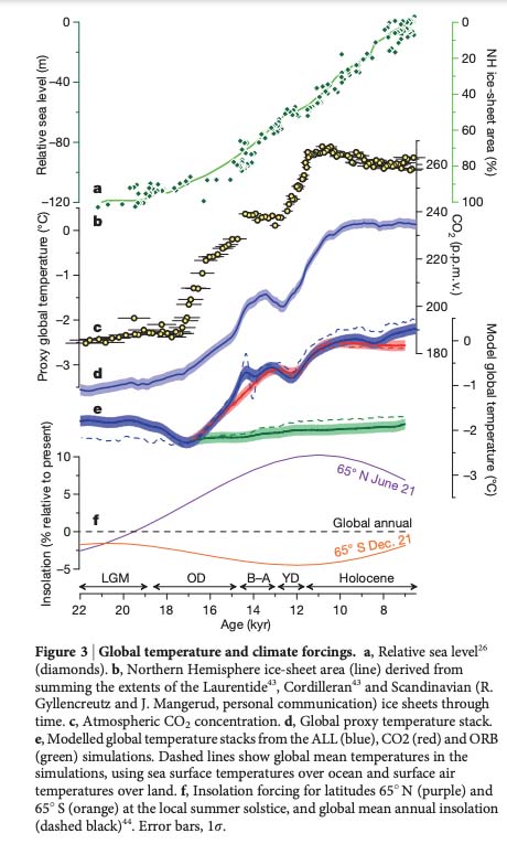
I pulled the whole XKCD cartoon into Photoshop, re-sized it and turned it on its side, and then set it side by side with Figure 3 from Shakun, et al. The red line is at 4,000 BC, roughly 6 kiloyears ago.
- What impression did the very end of the graph make on you? What questions did you have about that part?
The end of the graph was shocking to see how significantly the temperature increased in such a small amount of time.
 Cartoonists often exagerrate or emphasize one or two notable details of a person when drawing a celebrity. What is exagerrated or notable about this temperature timeline cartoon? Why do you think he choose to do it this way? Does this way of showing things emphasize anything in particular?
Unfortunately, it is not exaggerating the sharp increase in temperature from the 1900s to the 2000s.
Cartoonists often exagerrate or emphasize one or two notable details of a person when drawing a celebrity. What is exagerrated or notable about this temperature timeline cartoon? Why do you think he choose to do it this way? Does this way of showing things emphasize anything in particular?
Unfortunately, it is not exaggerating the sharp increase in temperature from the 1900s to the 2000s.I think what the artist exaggerates is the length of the cartoon, it goes on for pages and pages... I think he does it this way to emphasize how much the climate is changing now and how different it is from times past.
- What other questions arose for you as you read through this?
Several wanted to know which of the trajectories shown at the end we're on.
Welllll, see Climate-lab-book's comparison with the AR5 RCPs(!)
To keep the world from warming beyond 1.5 C here's a recent estimate of how much carbon we can emit
Q: Can we know temperatures from this long ago?
A: Yes. Here's my attempt to explain how this isotope ratio technique works. Here are some words from a Scientific American article about the same thing.
Palynology, the study of pollen, reveals what species where alive or not (heat-loving or cold-loving species) so can act as a check on the results.
"Comedy as a tool to demystify science"
 by Jessamyn Fairfield
Physics 16, 179 (2023), published by the American Physical Society (APS)
[T]he mindset of comedy is quite like the mindset of scientific research. Both involve creative exploration—asking, If this is true, what else is true?—and an unwillingness to accept the status quo without verifying it for oneself.
Simply presenting facts does not change minds and indeed can often make people dig their heels in to preserve their existing views. But the lateral approach of comedy, with its embrace of multiple perspectives, can be much more persuasive.
[My emphasis]